Improving Signup and Onboarding Flow for Health Benefits Platform
Problem & Context
The onboarding flow was the first impression for new users but created friction instead of confidence.
- Issues observed:
- Users abandoned due to unclear progress indicators.
- Input fields were unintuitive and inconsistent.
- No “back” option → users restarted from scratch.
- Multiple contracts created unnecessary complexity.
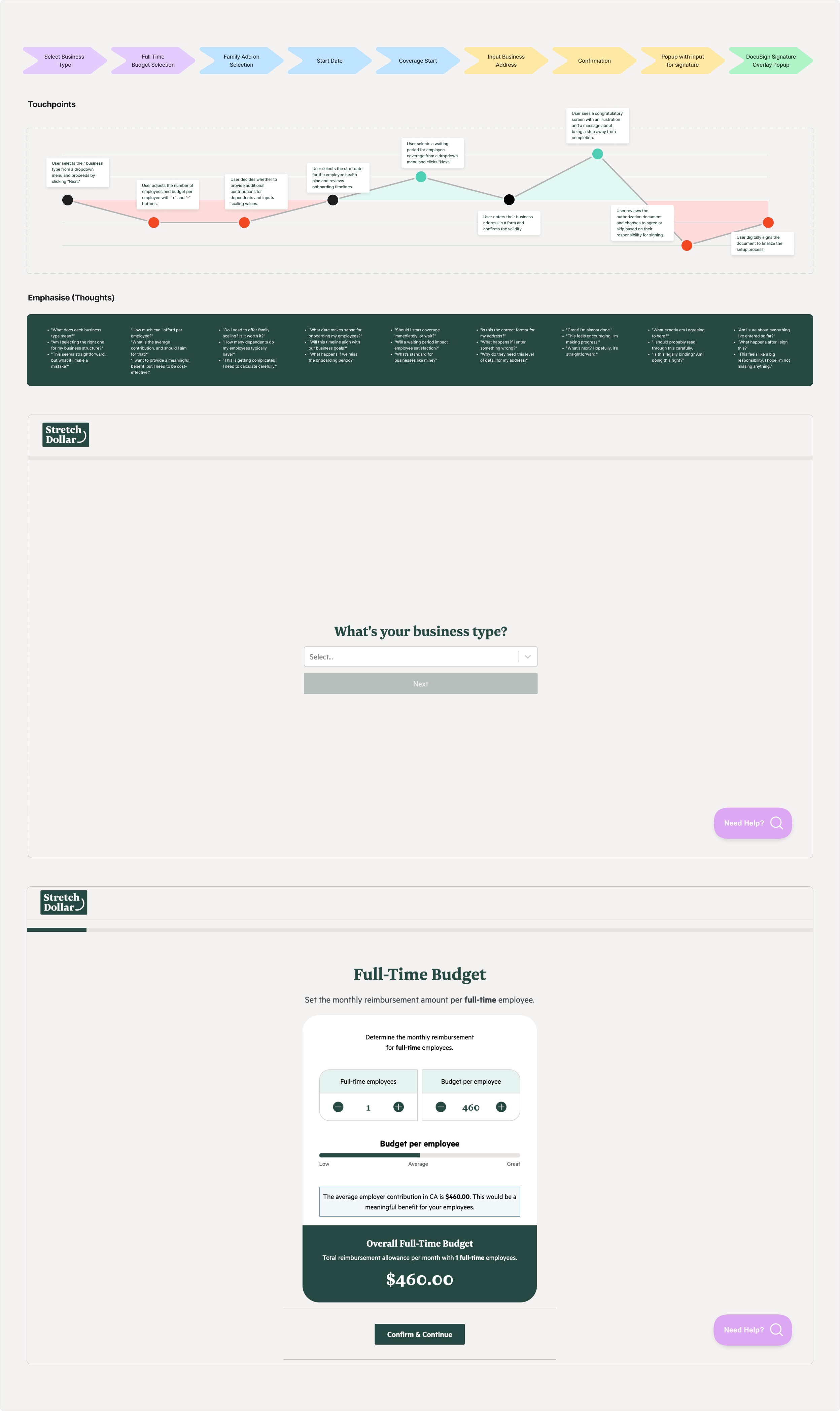
- Hotjar & usability findings:
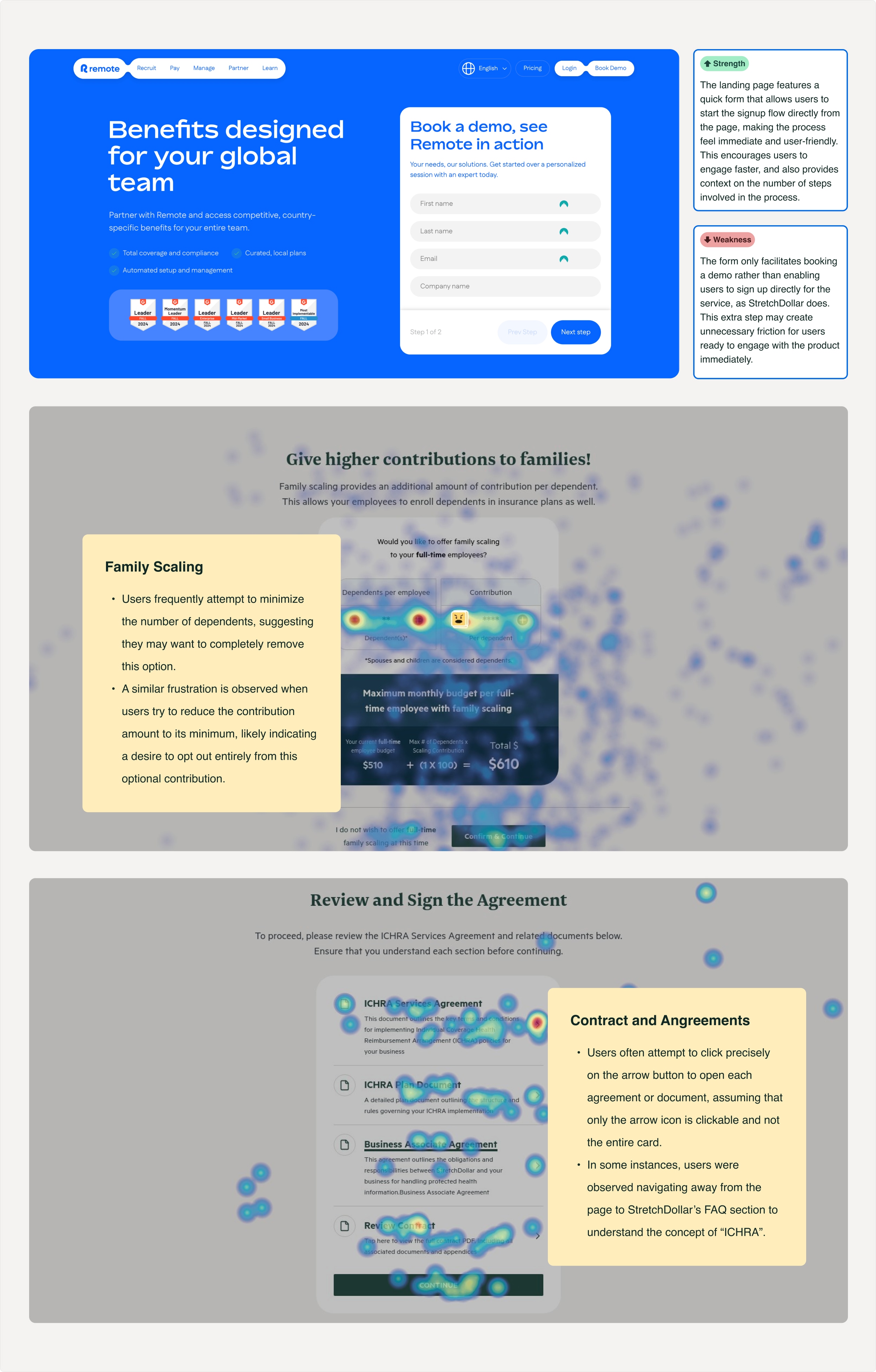
- Users tried interacting with a non-functional slider.
- Many attempted to minimize or opt out of “family scaling” contributions.
- Contracts were perceived as clickable only through small arrows.
- Some left to FAQs to understand terms like “ICHRA.”
- Heuristic violations:
- Visibility of system status → users didn’t know how long signup would take.
- Consistency & standards → unfamiliar input designs caused errors.
- User control & freedom → no undo or skip created frustration.
- Clarity & affordance → vague CTAs risked being seen as “dark patterns.”
- Competitor gap: Competitors offered clearer progress indicators and quick entry forms; StretchDollar lagged in efficiency and trust-building.
The Process
We followed a Design Thinking approach across discovery, define, and ideation phases.
- Discovery
- Hotjar recordings, heatmaps, user feedback.
- Heuristic evaluation flagged major usability gaps.
- Competitor analysis benchmarked best practices.
- Define
- Problem statement: Signup was too lengthy and confusing.
- Primary goal: Faster, intuitive experience that builds trust.
- KPIs:
- Increase signup completion rate.
- Reduce time-to-completion.
- Minimize drop-off points.
- Pain points mapped to heuristic violations.
- Scope & constraints: simplify UX without overhauling backend.
- Ideation
- Generated “How Might We” questions:
- Reduce time (e.g., presets, automation).
- Provide better feedback (progress, reviews).
- Improve clarity (clear CTAs, standard inputs).
- Reduce drop-off (exit intent, trust signals).
- Prioritized ideas that balanced user benefit with feasibility.
- Generated “How Might We” questions:
The Solution Explained
The redesign applied the ideation outcomes into tangible product changes.
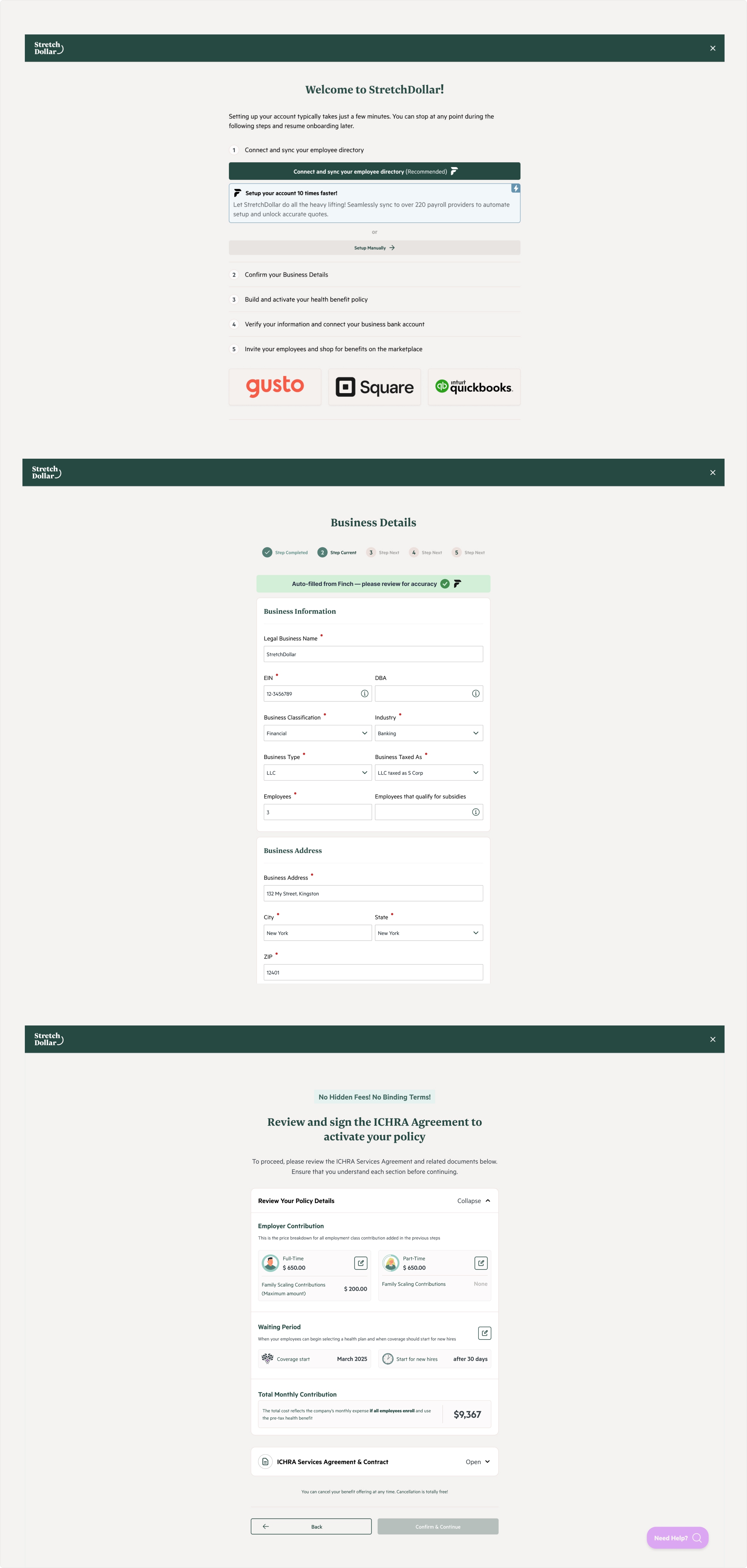
- Clear progress & transparency
- Step overview added at the very beginning.
- Contextual guidance explains each step’s purpose.
- Final review screen combines policy details + agreement.
- Automation to reduce manual effort
- Finch integration auto-imports business and employee data.
- Reduces repeated manual inputs, speeds up completion.
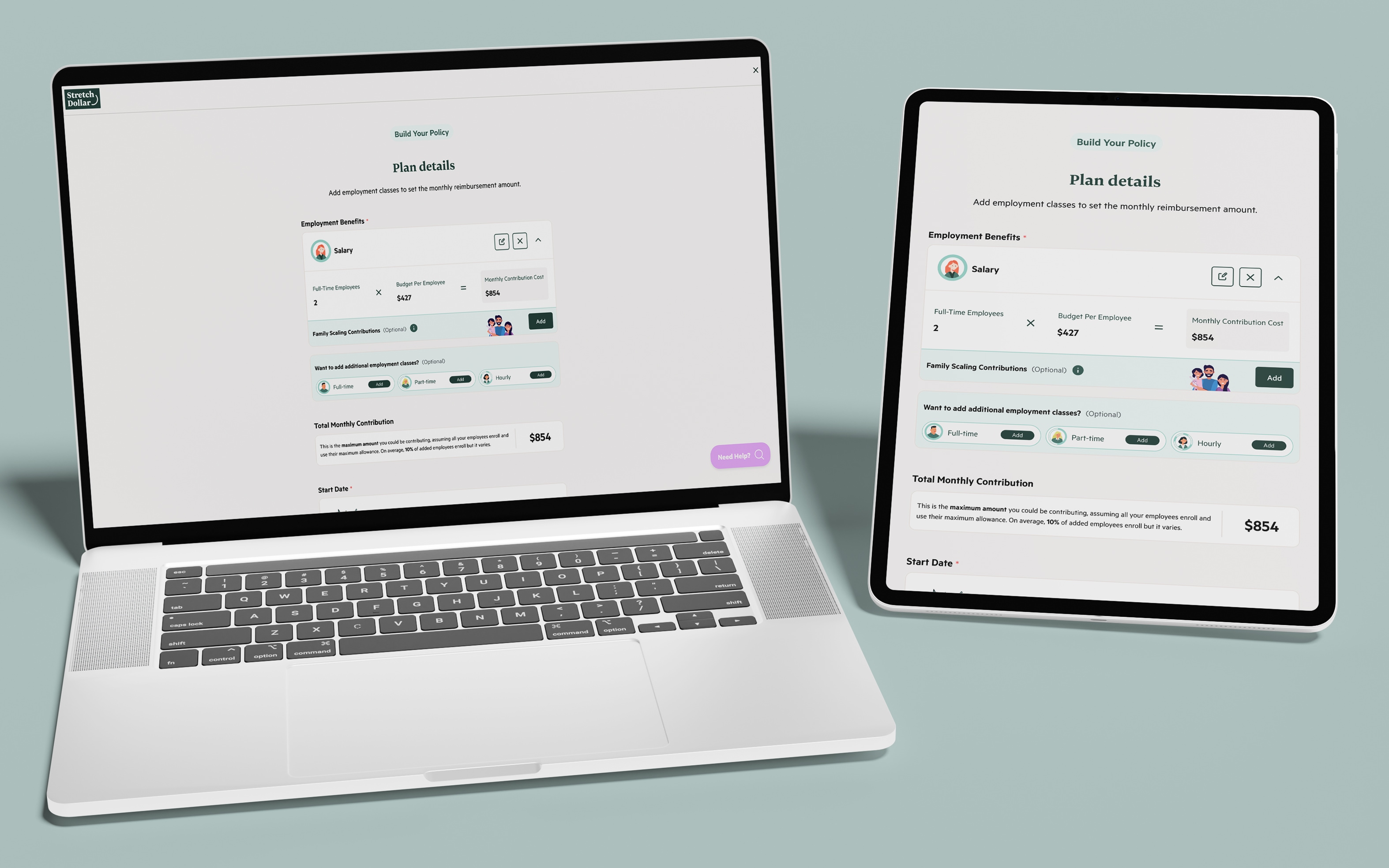
- Redesigned policy builder
- Contributions, family scaling, and waiting periods consolidated in one structured view.
- Standardized input fields for clarity and consistency.
- Simplified agreements
- Five separate contracts merged into one expandable file.
- Transparent, less intimidating, easier to review.
- Trust-building UX improvements
- CTAs rewritten to clearly reflect user choices.
- Hover states and back/edit options added.
- Cancellation messaging (“cancel anytime”) reassures users.

Results & Benefits
The outcome was a faster, clearer, and more trustworthy signup flow that aligned with user expectations and business goals.
- User benefits:
- Faster signup with less manual work (average completion time cut from 11 minutes to 5 minutes, a 55% improvement).
- Confidence through clear step-by-step guidance and a final review screen.
- Freedom to edit, skip, and review before finalizing, preventing restarts.
- Business benefits:
- Signup completion rate rose from 52% to 71%, adding significantly more users into the platform ecosystem.
- Drop-offs at critical steps were drastically reduced.
- Monthly support tickets related to signup dropped.
- Trust & perception:
- User satisfaction (CSAT for onboarding) improved from 3.2 → 4.6 out of 5, showing that contextual guidance and simplified agreements built credibility.
Overall, the redesign delivered measurable gains: higher conversions, faster onboarding, and fewer user frustrations, while also easing operational support demands.
Keen to find out more about this project?
While it's difficult to show everything here, I have more screenshots or details that I can speak about during our call or additional links to share.
Got a challenge?
Let me take a look!
I approach design with curiosity and a hands-on mindset. Whether it’s a product flow or a full system, I love diving in, asking the right questions, and designing solutions that make an impact.