Multi-Brand, Enterprise-Grade Design System
Problem & Context
Bally’s Interactive manages a portfolio of gaming brands across different markets. Each had its own look and feel, but internally this caused major challenges:
- Duplicated work – every brand team was designing and building the same UI elements.
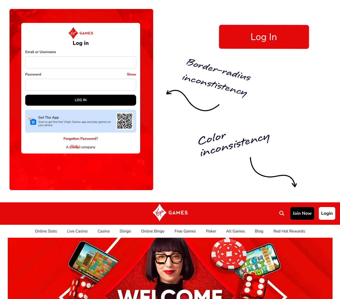
- Inconsistency – buttons, forms, and layouts looked and behaved differently across products.
- Slow delivery – launching a new feature or brand could take weeks because design and dev work had to be repeated.
The challenge: create a multi-brand design system that was consistent at its core but flexible enough to adapt to each brand’s identity.
The Process
The Product Manager led the system rollout, while my contribution was focused on the UI design foundation and component creation.
- Discovery & Alignment
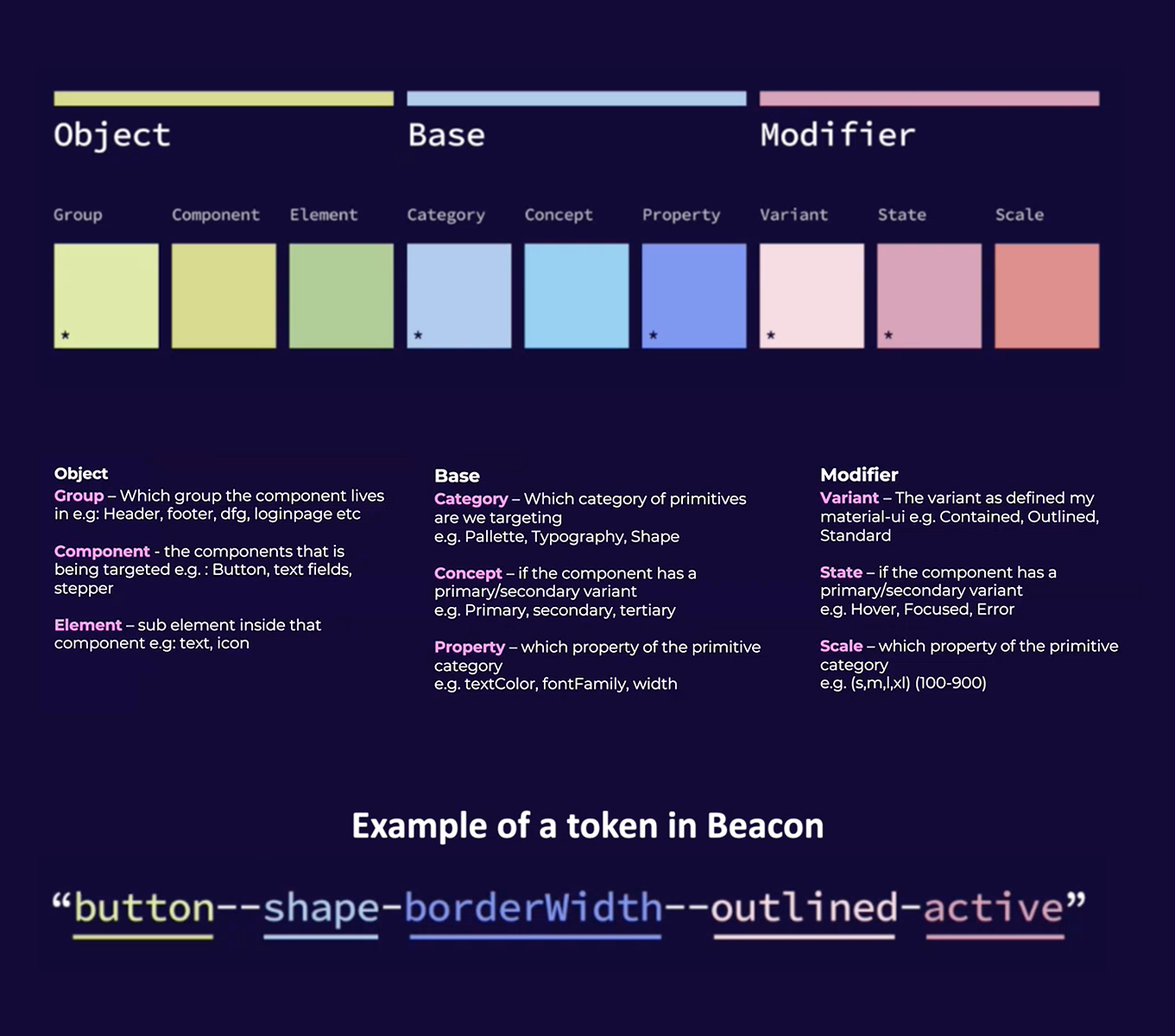
I participated in workshops where we audited existing brands, identified overlapping UI patterns, and agreed on the priority components that would benefit most from systemization. - Design Tokens
I helped define the brand-agnostic token set:- Typography scales (font families, sizes, weights, line heights)
- Color roles (primary, secondary, success, error, backgrounds, text)
- Spacing, borders, shadows, breakpoints
These tokens became the foundation for theming each brand.
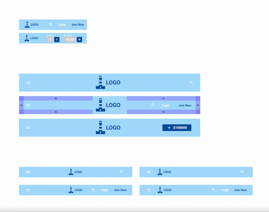
- Atomic Design Components
I designed atomic-level elements (buttons, inputs, checkboxes, tags) and built them up into composite components (forms, modals, navigation). Each was built with Figma properties and variants for states, sizes, and responsiveness. - Developer Collaboration
I worked closely with engineers to ensure parity between Figma and Storybook. I provided annotated Figma files, tested states and variants, and adapted components when issues came up in implementation. - Documentation
To make adoption easier, I contributed to Zeroheight documentation, showing when and how to use each component and how tokens applied to branding.
The Solution Explained
The outcome was Beacon, a multi-brand design system that:
- Provided a unified Figma library of tokens and components.
- Allowed multi-brand theming through token overrides — one component library could be skinned to fit multiple brands.
- Delivered reusable, tested components in Storybook and CDN, ensuring consistency between design and development.
- Created a single source of truth with clear documentation for designers and engineers.
Results & Benefits
Beacon significantly reduced duplicated design and development work.
With brand-agnostic tokens and reusable components, new brand rollouts became up to 3× faster, while day-to-day design tasks were streamlined, cutting 30% of duplicated effort.
Developers reported fewer UI-related issues, and handoffs became 40% more efficient thanks to Storybook and Zeroheight documentation.
Keen to find out more about this project?
While it's difficult to show everything here, I have more screenshots or details that I can speak about during our call or additional links to share.
Got a challenge?
Let me take a look!
I approach design with curiosity and a hands-on mindset. Whether it’s a product flow or a full system, I love diving in, asking the right questions, and designing solutions that make an impact.