Crypto Web3 Application Design
Cryptoupp is a web app designed to empower retail traders and investors in the cryptocurrency market by offering an unbiased, community-driven space to share and evaluate feedback on crypto projects. Research revealed that most available platforms were either biased toward professional voices or lacked transparency. Using the Double Diamond design process, I led research, ideation, and design to build a user-friendly, engaging platform. The final solution introduced structured information architecture, responsive prototypes, and a consistent UI kit. The result was a scalable, modern platform that improves trust, encourages participation, and increases the quality of community insights.
Problem & Context

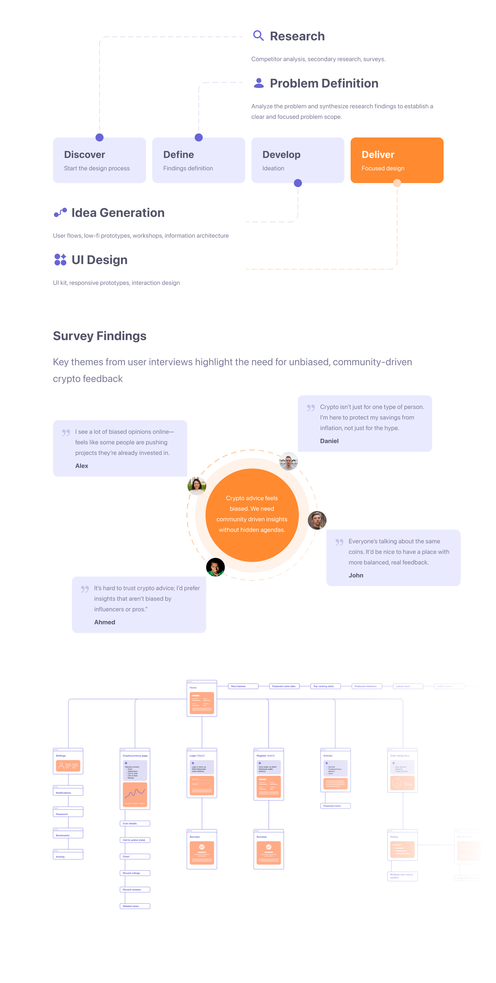
The Process
The project followed the Double Diamond design process:
- Discover (Research & Problem Definition)
- Secondary research into investor behavior uncovered strong biases, such as overconfidence and herd mentality, influencing investment decisions.
- Survey interviews revealed frustration with biased online advice, lack of transparency, and difficulty finding community-driven insights.
- User persona development (e.g., John Newman, 25, digital marketer) highlighted the need for quick, unbiased, and social features for time-limited retail investors.
- Define
- Synthesized insights into a clear problem: retail investors lacked a trusted, community-driven platform to balance biased, professional-driven narratives.
- Goals: Create a user-friendly, transparent interface that encourages participation and improves decision-making in the crypto space.
- Develop (Ideation)
- Workshops and flows focused on unbiased project rating, simplified navigation, and transparent community features.
- Structured the information architecture to support discoverability across ratings, articles, news, and project details.
- Deliver
- Moved from low-fidelity to high-fidelity prototypes.
- Designed a modern UI system (typography, color, component kit) tailored to crypto users’ expectations.
- Delivered scalable responsive layouts optimized for both desktop and mobile.
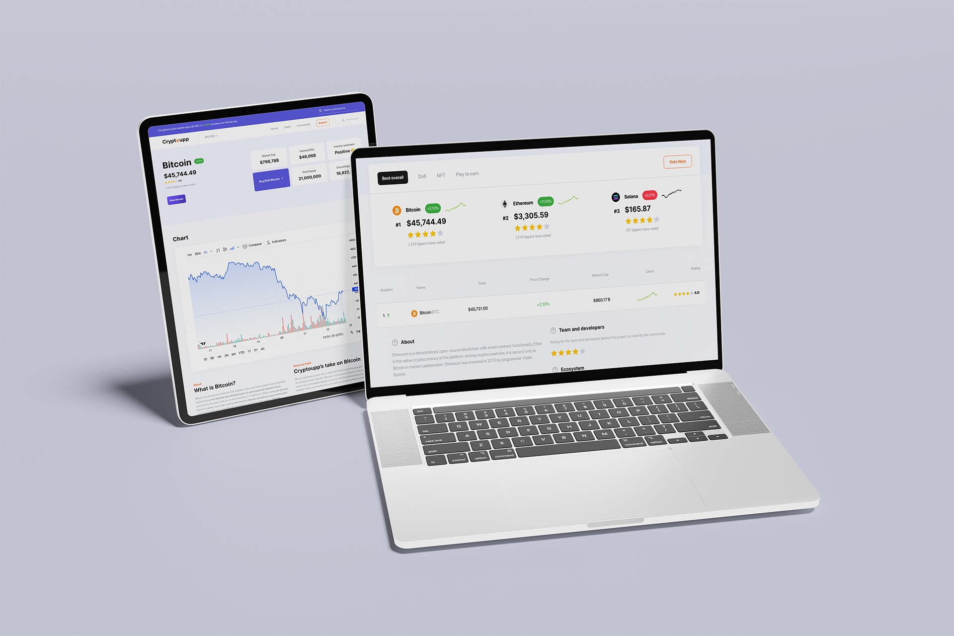
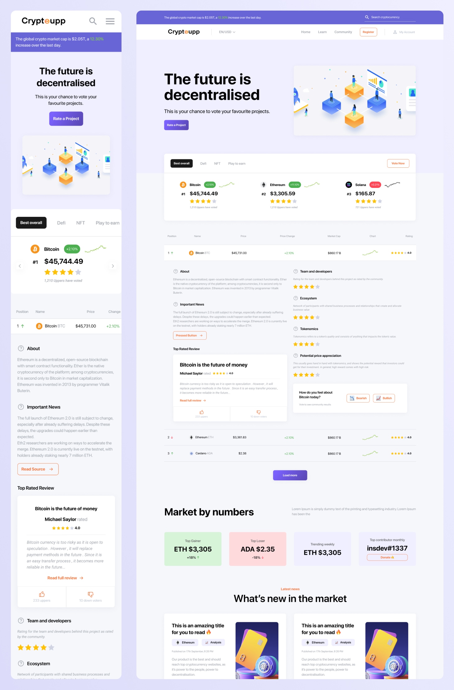
The Solution Explained
Information Architecture & Flows
- Clear paths from browsing to rating: market cards → project detail → rate/share → see community breakdown.
- Reduced friction between reading insights and contributing your own.
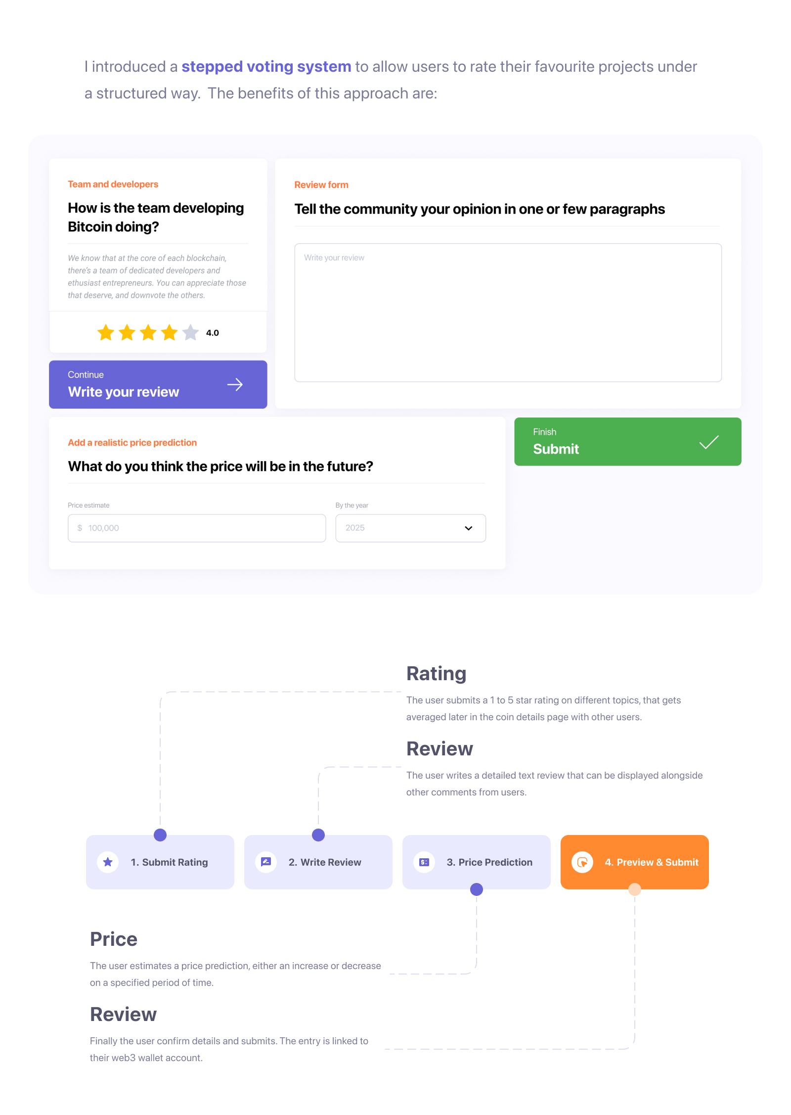
Core Interactions
- Project rating & reviews as first-class actions.
- Contextual modules (top reviews, related news) to balance opinions with timely data.
UI System & Branding
- Inter for legibility; bold headings + concise body text for scanability.
- Color strategy: Purple (#6765D6) for credibility/tech; Orange (#FF8A30) for emphasis and calls-to-action.
- Reusable tokens for spacing, states, and button variants to ensure speed and coherence.
Content & Trust
- Balanced layout mixing community sentiment with factual context (“Market by numbers”).
- Visual hierarchy that surfaces the signal first (rating summary, trends) and lets users drill into detail.
Results & Benefits
User impact (validation signals)
- Test participants reported higher trust in project pages due to visible community ratings alongside factual context.
- Lower cognitive load from clear navigation and consistent components; easier path from reading to rating.
- Faster contribution thanks to focused rating UI and clear CTAs.
Business impact
- Differentiates Cryptoupp as a credible, community-first companion to news/influencer feeds.
- Scalable design system reduces delivery time for new features and pages.
- Prototype fidelity enabled smoother stakeholder alignment and implementation readiness.
Keen to find out more about this project?
While it's difficult to show everything here, I have more screenshots or details that I can speak about during our call or additional links to share.
Got a challenge?
Let me take a look!
I approach design with curiosity and a hands-on mindset. Whether it’s a product flow or a full system, I love diving in, asking the right questions, and designing solutions that make an impact.